data entry
vs other apps
industry average
An expense tracker built for how India actually spends
Cent started from a frustration I think a lot of people have. You spend money on UPI all day, get SMS alerts you immediately forget, and then feel vaguely guilty at the end of the month without knowing where it all went. I wanted to design something that tracked your spending without you having to think about it.
Most expense tracking apps I looked at made the problem worse by adding more steps. Log in, find the add transaction button, fill in amount, category, account, save. By that point you have already forgotten the context. I wanted to design something where being financially aware required almost no effort at all.
A personal project to get my hands on Figma Make. This isn't a full app - it's a targeted interaction case study where a user receives a notification and categorizes it. The AI then learns the merchant-category mapping for future automation.
- FinTech
- AI UX
- Interaction Design
Zero-effort expense tracking
The final design reduces manual data entry friction through smart notifications and a unified mobile-first experience.
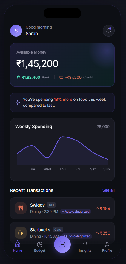
Home Dashboard
An overview of available balance and recent transactions categorized automatically.
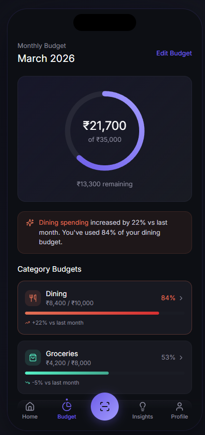
Monthly Budget
Real-time tracking of category limits so you always know what's remaining.
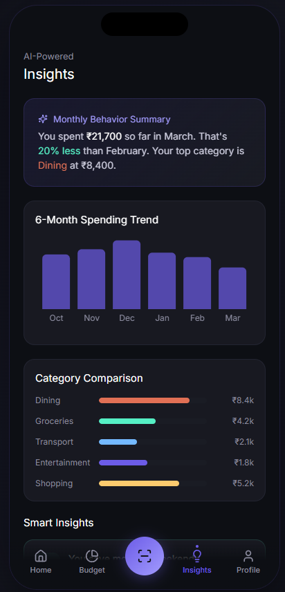
AI-Powered Insights
Contextual summaries of your spending behavior compared to previous months.
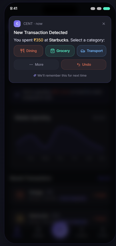
Interactive Notification
Categorize spending right from the push notification-no need to open the app.
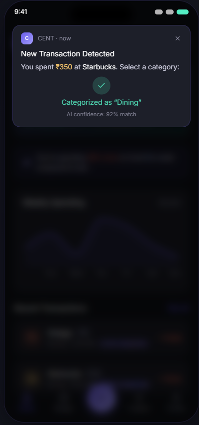
AI Confidence
The app learns your merchants and automatically assigns tags with high confidence.
From discovery to final design
A quick overview of how this solution evolved from problem discovery to the final design.
9 steps from research to design
Cent started from a frustration I think a lot of people have. You spend money on UPI all day, get SMS alerts you immediately forget, and then feel vaguely guilty at the end of the month without knowing where it all went. I wanted to design something that tracked your spending without you having to think about it.
Most expense tracking apps I looked at made the problem worse by adding more steps. Log in, find the add transaction button, fill in amount, category, account, save. By that point you have already forgotten the context. I wanted to design something where being financially aware required almost no effort at all.
Cent turns financial tracking from a manual task into an ambient behaviour. You spend, it notices, you tap once, it learns. Over time you do not even need to tap, it just knows.
The issue is not that people do not want to track their spending. Most people I spoke to genuinely wanted to be more aware of where their money was going. The issue is that every existing solution required effort at exactly the wrong moment - right after you have just paid for something and want to move on.
I looked at two things in research: how people actually behave around money day-to-day, and what is specific to the Indian context that most expense apps are completely ignoring.
Two personas came out of the research pretty clearly. Both wanted the same outcome - financial clarity - but their relationship with effort was completely different. Riya would use the feature if it was fast enough. Aman would only use it if it was invisible.
Mapping the current journey made it obvious where the problem was. It was not that people did not care - it was that the window between spending and awareness was too wide. By the time someone opened a tracking app, the moment had passed and the motivation had gone with it.
Each question came from a specific user behaviour pattern observed in research.
- "How might we reduce friction in expense tracking to near zero?
- "How might we use real-time context to improve categorisation?
- "How might we design for habit formation rather than just feature adoption?
The feature list was built by going through every step in the painful journey and asking what would need to exist to make that step disappear. Anything that added effort was cut or pushed to advanced.
The navigation was designed around the assumption that most users will only ever look at the home screen. If the home screen answers "how am I doing today", most people do not need to go anywhere else. Everything else exists for users who want to go deeper.
Recent transactions
Live progress
Spending patterns
These are estimated numbers based on the behavioural research, comparable fintech app data I found publicly, and what I would realistically expect given the specific friction points Cent removes.